The Expanding Universe of Olink Insight
Navigation redesign for a growing scientific platform
Olink Insight started as a focused platform with just a couple of features. But like many growing tools, it gradually expanded into a collection of powerful, yet scattered, capabilities. Each solved a specific problem — but together, they became a puzzle box with no obvious opening move.
To users, this felt arbitrary. It was difficult to answer basic questions like:
Where do I begin my study?
What can this tool actually do for me?
We weren’t just adding features — we were expanding a universe.
And without a coherent structure, that universe became harder to explore.
✦ Rebuilding the Map
Workshops and interviews with internal teams and users revealed a simple truth: most researchers weren’t navigating by feature — they were navigating by intent. They weren’t looking for features like Panel Selection or Gene Ontology Search. Half of the time they didn't even know what those features could do for them. They were asking questions like:
What proteins should I work with?
What product fits my list?
Can I trust the data?
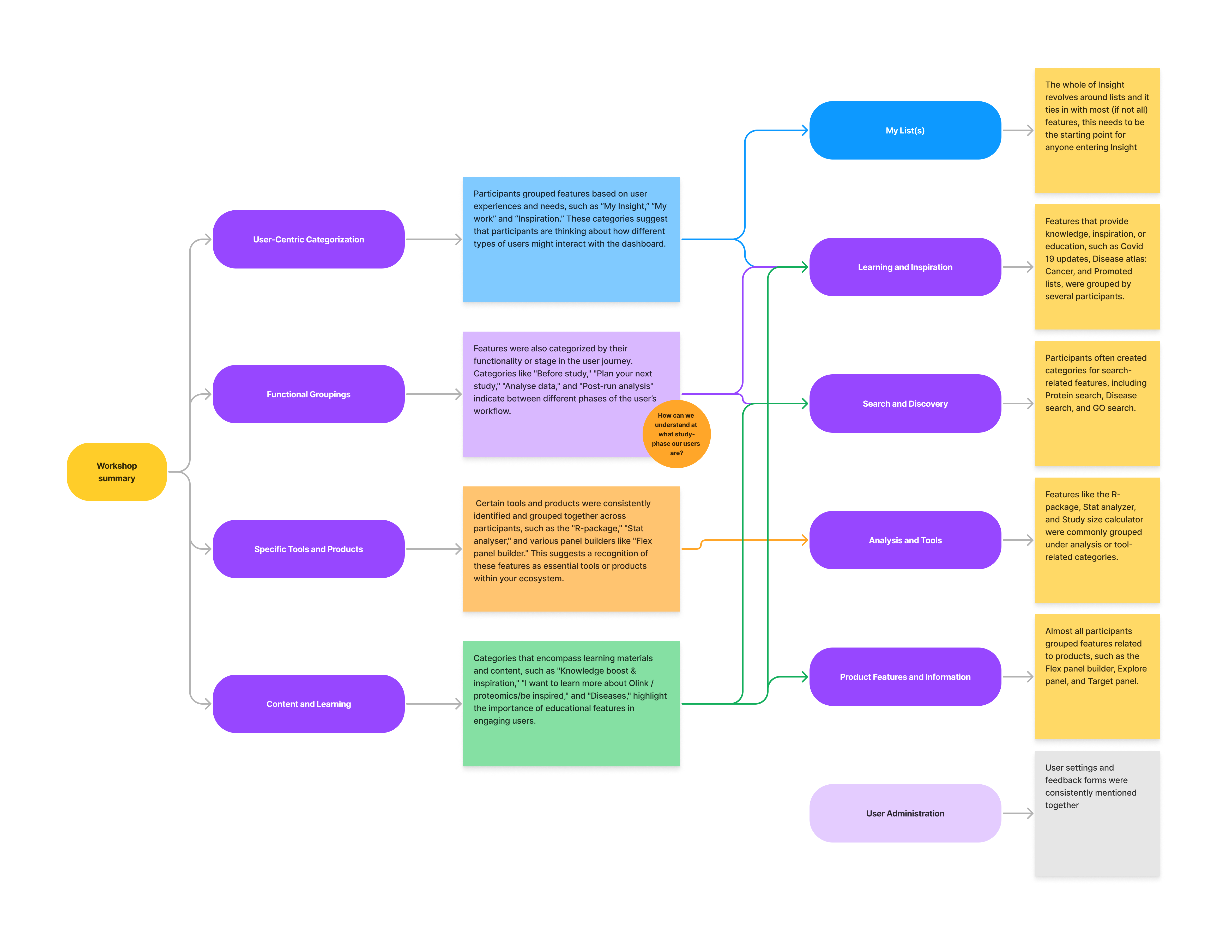
To uncover a meaningful structure, we ran open card-sorting sessions with stakeholders across development, product, and support. Each team brought a different mental model to the table. Through multiple iterations, we asked not just where features should go — but what they meant. What questions did they help answer? How early or late in the research stage did they belong?
This eventually led to broader discussions around what the research journey actually looks like in practice. We sketched loops, overlaps, even dead ends and used those patterns to shape a system that felt not just functional, but familiar.

✦ The Solution: From Puzzle Pieces to Pathways
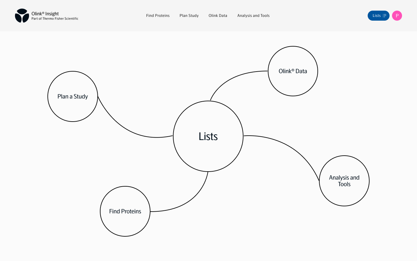
The new navigation introduced four clear entry points, grouped not by feature type, but by user goal. Each section is supported with tool and feature descriptions — making functionality legible before interaction. This shift in perspective from software architecture to research journey allows users not to navigate by trial and error, but by task and goal.

Lists
Create, manage and reuse protein lists across tools and workflows.
Find Proteins
Build lists using biological context: pathways, diseases, gene ontology and converting gene names.
Plan Study
Select products, explore coverage, design custom panels, calculate study size.
Olink Data
Explore curated data stories and normal ranges from Olink’s internal studies.
Analysis and Tools
Analyze data, search publications, access R packages and visualization tools.
✦ The Result: A Structure That Scales
The redesign took inspiration from the visual language of the Olink.com. The updated structure nodded subtly toward brand cohesion without sacrificing usability.
Internally, this change gave developers and PMs a cleaner model for growth. Externally, it gave users orientation.
“It finally feels like everything has a place and I know where to go next.”
- User feedback
Support stopped explaining the interface. — and started discussing science.
The product team gained the breathing room they needed to build without working around legacy UX. The nav became what it should’ve always been: a map, not a maze.
In complex tools, structure is design. It's the quiet system that shapes how users think and whether they trust what they're seeing. This navigation redesign redefined how Olink Insight welcomed its users: not just with access, but with understanding.